Kannada, English or Both? Getting Bilingual Branding Right in Karnataka
From shop signboards to packaging and Instagram, more Karnataka businesses are going bilingual. Here is how to design a brand that reads beautifully in Kannada and English — without looking cluttered.
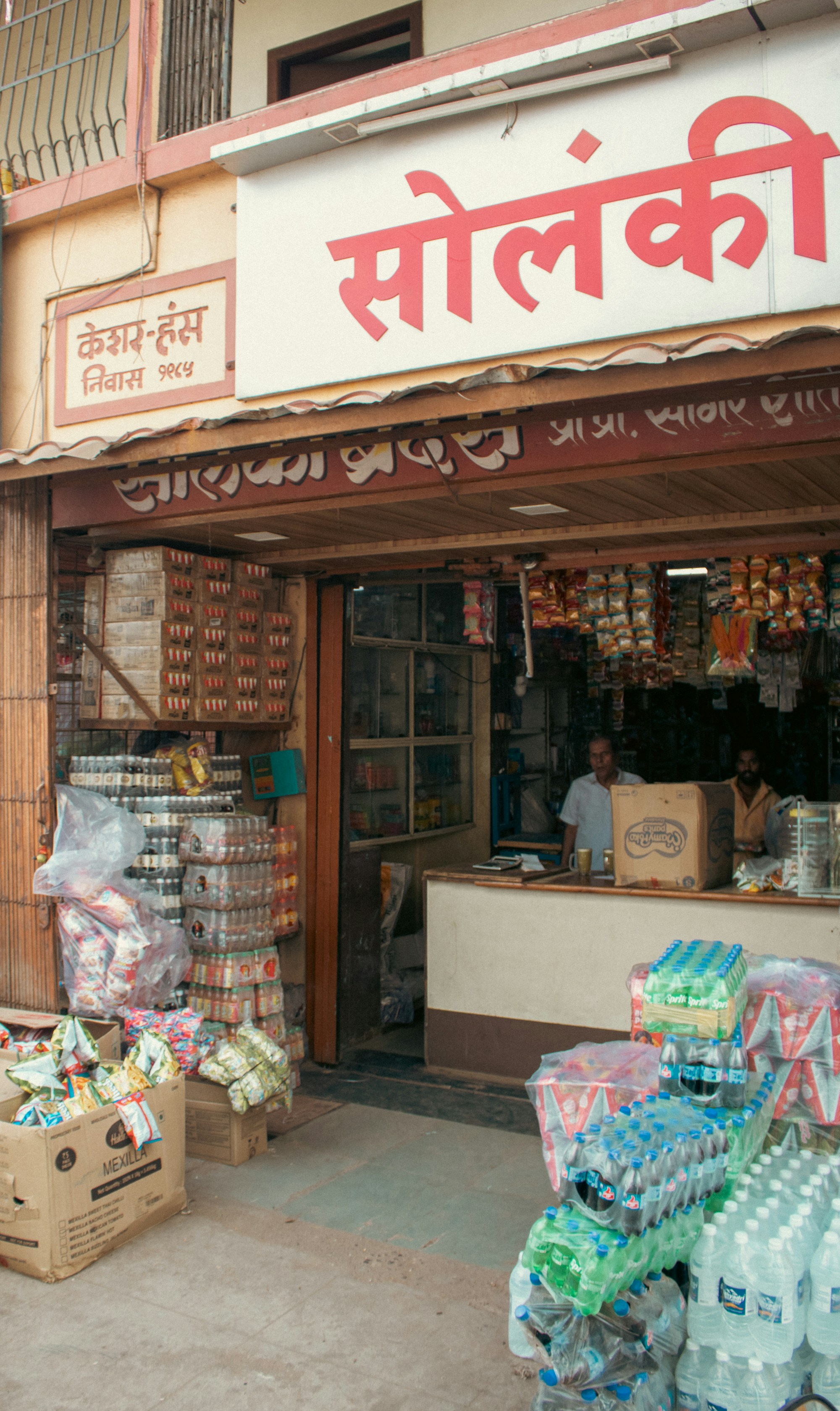
Walk down any busy road in Mangaluru or Udupi and you will see it: more and more signboards, menus and shop fronts now carry Kannada prominently alongside English. Part of that is pride in the local language, part of it is customer expectation — and part of it is regulation.
In 2024 Karnataka amended its Kannada language law to require that Kannada take up 60% of commercial nameboards, and the rule has since been the subject of legal challenges. Requirements and enforcement can change, so always check the current rules with your local authority before you print. Either way, designing your brand to work in both scripts is simply good business.
Why bilingual branding is worth doing well
- It builds trust locally. Customers notice when a business speaks their language.
- It future-proofs your signage. Planning for Kannada from day one is cheaper than redesigning boards later.
- It still works for visitors. English keeps you accessible to students, tourists and online shoppers.
Five principles we follow
1. Design both versions together
The most common mistake is designing an English logo first and “adding Kannada” later in whatever font is available. Kannada letterforms are rounder and taller; they need their own spacing and weight so both versions feel like the same brand.
2. Pair typefaces carefully
Choose a Kannada typeface whose stroke weight and personality match your English font — a modern geometric English font next to a traditional, ornate Kannada font looks mismatched. There are good open Kannada typefaces available today; the trick is tuning sizes so both scripts look visually balanced, not just equal in point size.
3. Decide the hierarchy
On a signboard, which language leads? If regulations require Kannada to be dominant, make that a design decision rather than an afterthought: give Kannada the larger, upper position and let the English line support it.
4. Check spelling with a native reader
Machine translation still makes awkward mistakes in Kannada, especially for brand names and tag lines. Always have a fluent reader proof the final artwork — ideally someone from your own customer base.
5. Build a simple brand guide
Write down which fonts, sizes and layouts to use in each language, with examples for signboards, packaging, social posts and invoices. It keeps every printer and designer you work with consistent.
Don’t forget Tulu and Konkani
On the coast, a well-placed line in Tulu or Konkani — a greeting on a menu, a festival wish on Instagram — can create a warmth no ad budget can buy. It does not need to be on your signboard; small touches in campaigns work beautifully.
A good bilingual brand doesn’t look translated. It looks like it was always meant to speak both languages.
Need a hand?
Prisyn Labs designs logos, signboards, packaging and complete brand guidelines that work in Kannada and English for businesses across Mangaluru, Udupi, Puttur, Sullia and Kasaragod. See our branding service.